Posts

Showing posts with the label Data Visualization

The DataOps Landscape

Image
Data has emerged as an imperative foundational asset for all organizations. Data fuels significant initiatives such as digital transformation and the adoption of analytics, machine learning, and AI. Organizations that are able to tame, manage, and unlock their data assets stand to benefit in myriad ways, including improvements to decision-making and operational efficiency, better fraud prediction and prevention, better risk management and control, and more. In addition, data products and services can often lead to new or additional revenue. As companies increasingly depend on data to power essential products and services, they are investing in tools and processes to manage essential operations and services. In this post, we describe these tools as well as the community of practitioners using them. One sign of the growing maturity of these tools and practices is that a community of engineers and developers are beginning to coalesce around the term “DataOps” (data operations). Our conver...
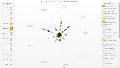
2019 Was the Year Data Visualization Hit the Mainstream

Image
There’s always something going on in the field of data visualization but until recently it was only something that people in the field noticed. To the outside world, beyond perhaps an occasional Amazing Map®, Tufte workshop or funny pie chart, these trends are invisible. Not so in 2019, where data visualization featured prominently in major news stories and key players in the field created work that didn’t just do well on Dataviz Twitter but all over. 2019 saw the United States President amend a data visualization product with a sharpie. That should have been enough to make 2019 special, but the year also saw the introduction of a data visualization-focused fashion line, a touching book that uses data visualization to express some of the anxieties and feelings we all struggle with, as well as the creation of the first holistic professional society focused on data visualization. Original Article >>>

Apache Superset in the Production Environment

Image
Visualizing data helps in building a much deeper understanding of the data and quickens analytics around the data. There are several mature paid products available on the market. Recently, I explored an open source product name Apache Superset which I found a very upbeat product in this space. Some prominent features of Superset are: A rich set of data visualizations. An easy-to-use interface for exploring and visualizing data. Create and share dashboards. After reading about Superset, I wanted to try it, and as Superset is a Python programming language-based project we can easily install it using pip; but I decided to set it up as a container based on Docker. The Apache Superset GitHub Repo contains code for building and running Superset as a container. Since I want to run Superset in a completely distributed manner and with as little modification as possible in the code, I decided to modify the code so that it could run in multiple different modes. Below is a list of sp...

Best Machine Learning Tools

The best trained soldiers can’t fulfill their mission empty-handed. Data scientists have their own weapons  —  machine learning (ML) software. There is already a cornucopia of articles listing reliable machine learning tools with in-depth descriptions of their functionality. Our goal, however, was to get the feedback of industry experts. And that’s why we interviewed data science practitioners — gurus, really  — regarding the useful tools they choose for  their  projects. The specialists we contacted have various fields of expertise and are working in such companies as Facebook and Samsung. Some of them represent AI startups (Objection Co, NEAR.AI, and Respeecher); some teach at universities (Kharkiv National University of Radioelectronics). The AltexSoft data science team joined the discussion, too. And if you’re looking for a particular type of tools, just skip to your sector of interest: Languages used in machine learning Data analytics an...

Improving Netflix’s Operational Visibility with Real-Time Insight Tools

Image
For Netflix to be successful, we have to be vigilant in supporting the tens of millions of connected devices that are used by our 40+ million members throughout 40+ countries. These members consume more than one billion hours of content every month and account for nearly a third of the downstream Internet traffic in North America during peak hour From an operational perspective, our system environments at Netflix are large, complex, and highly distributed. And at our scale, humans cannot continuously monitor the status of all of our systems. To maintain high availability across such a complicated system, and to help us continuously improve the experience for our customers, it is critical for us to have exceptional tools coupled with intelligent analysis to proactively detect and communicate system faults and identify areas of improvement. In this post, we will talk about our plans to build a new set of insight tools and systems that create greater visibility int...

Xeno.graphics - a collection of unusual charts and maps

Image
Xeno.graphics is a collection of unusual charts and maps, managed by Maarten Lambrechts . Its objective is to create a repository of novel, innovative and experimental visualizations to inspire you, to fight xenographphobia and popularize new chart types. The xenographics collection will keep on growing. If you know of one that isn’t here already, please submit it . You can also expect some posts about certain topics around xenographics.

Netflix FlameScope

Image
Netflix has open-sourced its visualization tool for exploring variance, perturbations, single-threaded execution, application startup, and other time-based data as flame graphs. Details >>

Amazing Infographics and Other Visual Tutorials

Data Science Summarized in One Picture   R for Big Data in One Picture   A Cheat Sheet on Probability   Data Science in Python: Pandas Cheat Sheet   Cheat Sheet: Data Visualisation in Python   Machine Learning Cheat Sheet   The Periodic Table Of AI   Three Periodic Tables   40 maps that explain the Internet   A Guide to the Internet of Things   IoT Tectonics   13 Great Data Science Infographics   Unstructured Data: InfoGraphics   Great Machine Learning Infographics   What is Hadoop? Infog...

Fonts for Complex Data

Image
Type designers work with a diverse clientele, and yet common themes always seem to emerge in our conversations. This seems to be the season of complex typography, in which designers everywhere are faced with the challenge of presenting different and competing kinds of information to readers. An agency we’re working with is designing a demanding identity for a fast-moving consumer goods brand; an in-house art department is creating a responsive website for complex financial disclosures; a freelance graphic designer is doing the identity for a local coffeeshop, and discovering the joys and perils of digital menu boards. As always, the wrong fonts can lead designers into sticky dead ends, but the right ones can be immeasurably helpful. Here are some of the things our clients consider when faced with complex typography, and some of the typographic strategies that can be the quickest routes to success. Details:  https://www.typography.com/blog/fonts-for-complex-data

Tableau 10.5 with Hyper and server on Linux

Excited about new Tableau 10.5 with Hyper added as a data engine and Linux support. New features: https://www.tableau.com/products/new-features Hyper: https://www.tableau.com/products/technology